Lirhful Station - Ojo Caliente |
|
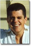
A graduate of DePauw University, Pat Garrahy also known as Ojo Caliente has had a varied career that started off working for Marvel and DC Comics. He has taught at the college level, worked as an art director for an Off-Broadway production and been involved in the advertising field.
See the light
"I first started using Vue d'Esprit 4. I was really impressed with the quality of atmospherics in the renders and the plant editor. I also felt as though the materials editor was really easy to understand and yet so amazingly deep and complex. Of course the introduction of EcoSystems and EcoSystem Materials in Vue 5 Infinite blew me away. Each Vue upgrades introduce a lot of significant additions. Vue 6 Infinite offers so many new features, and although I haven't had the opportunity to explore them all, I am currently obsessed with the object-based area lights."
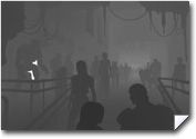
Scene's Construction
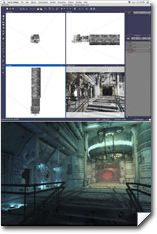
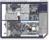
"I started with several interior models created by Stonemason.
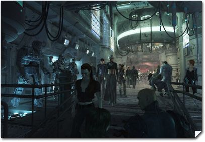
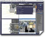
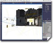
There are only about twelve conventional lights in this scene, whereas, there are hundreds of multi-shape area lights.
I wanted to create color with light. Since cool colors have a tendency to recede and warm colors advance in composition, I wanted to reverse this conventional approach to color space. Blue, green, yellow, orange, and red were used front to back to define an opposing recession of color, reversing the conventional approach.
The actual physical space is fairly short, so I adjusted the focal length of the camera to try and balance any advancement of the warm hues used in the background. I also tried to reinforce the figure ground by using darker values in the foreground, and regressing tones and tints of color into the background.""After I finished setting up the interior, I printed a few copies and sketched the placement and gesture of the figures in with a black sharpie. I then started to add figures one at a time. I would start a figure in Poser.
I would then bring the Poser figures into a new or blank Vue file, saving the figure as a .vob. Later I just saved the Vue file and merged it with my main file version. I was very pleasantly surprised to find Vue gave me the option to auto update my Poser imports, very cool little option."
"I think there are thirty-eight figures in total. I used the color scheme to indicate action. Figures in the cool foreground are more relaxed. As the figures regress into the warmer color space, they become more active. Eye contact of each of the figures played a strong role in the overall composition. I wanted to create a theme of suspicion."
"I use my second monitor to track my progress.
Whenever I see something I want to change, I write down a note and stick it on the second monitor.
As each change is incorporated into the actual Vue file, I remove the corresponding Post It.
I know a piece is moving towards conclusion when the Post It notes disappear from the monitor."
Compositing
"[To render], I split the file into five separate documents. I did decimate objects according to position in the figure ground. I created a certain amount of overlap in each of the files, and was very dependent on the merge feature to make additional elements, figures, and lights consistent in each of the five files. Ultimately I was also VERY dependent on the creation of rendered alpha maps for each of my five files.
I rendered many of these alpha maps separately from my final renders by using the "render only selected objects" render setting with my lighting turned off by deselecting the "always render lights" function.
These alpha maps were then easily copied and pasted into alpha channels and masks for each of the five final renders thereby making the final image a breeze to fit together."
Tips from making this project
"I always save my depth map renders.
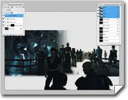
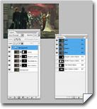
When I open the final renders in Photoshop I paste the depth map in as an alpha channel.
I like to use this depth selection to adjust color, for example.
Since color tends to desaturate according to distance and atmospheric perspective in nature, I can adjust the saturation of a render according to the distance of my depth map."
"I have also found the depth map selection is invaluable when used with small increments of Gaussian Blur.
Although Vue does render depth effects, I do like to control the amount of distance blur in post with this technique.
I've also used depth maps as blending layers.
By pasting a depth map into the layers palette in Photoshop you can apply rather unique color adjustments to a final render using blending modes and opacity settings.
Overlay, screen, and multiply are the blending modes I probably have used most often when applying a depth map as one of these layers."
Worst Critic
"Actually, I'm really happiest during the creation process. After I finish something I really love working on, I find it takes me about a week before I hate it. I always look back at old projects and see the things I could and should have executed better. I'm definitely my own worst critic."
http://www.ocpstudios.com/pages/tutor.html
www.ocpstudios.com - pjg@ocpstudios.com
-
Have you created an interesting project with the help of one of our products? Would you like to see your work showcased here, and benefit from e-on's exposure?
Get in touch with us! Contact press@e-onsoftware.com.
-


